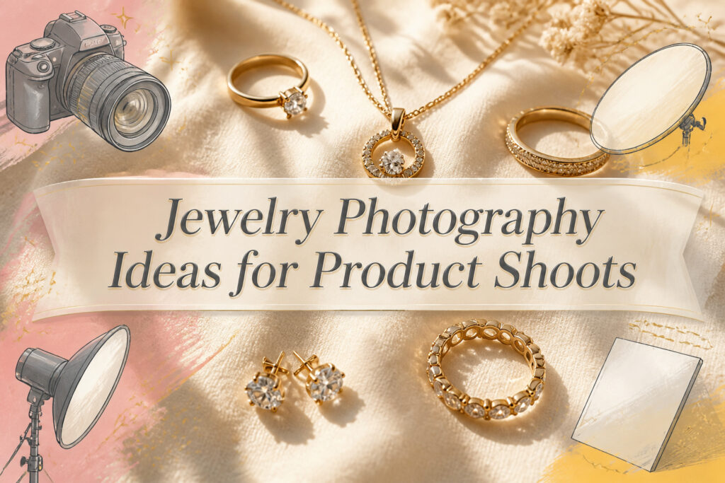
Jewelry photography ranges from a seamless paper sweep in your kitchen corner to a model shoot with motion blur at 1/60s, and the right choice depends on whether you need marketplace compliance or brand recognition. White backgrounds still rule e-commerce because algorithms demand them, but the same white can flatten gold into glare if the light sits wrong. The detail that separates a passable shot from one that converts is shadow control: a reflector card placed just out of frame, or a side light angled 10 to 15 degrees off the reflection path, keeps prongs readable and gemstones honest.
1. Simple White Background

A clean white backdrop puts the jewelry front and center, which is exactly why e-commerce platforms treat it as the default. The metal and stones get all the attention; nothing competes for the eye. That said, blown-out highlights on polished silver or gold can flatten the piece into a shapeless glare. Softbox lighting or diffused natural light fixes this, and a white reflector card bounces fill back into the shadows so detail survives.
For the surface itself, seamless paper or white vinyl both work. Paper costs less and swaps out when scuffed; vinyl lasts longer and wipes clean. A metal clamp holds either one in place on a solid table, and the whole setup fits in a corner at home. The simpler the arrangement, the harder it is to overcomplicate into something that fights the product.
2. Dark Background Focal Point

A black backdrop absorbs spill light instead of bouncing it back at the piece, which is exactly what you want when the metal itself needs to do the shining. White can outcompete a delicate chain or a soft gold; dark velvet or matte acrylic lets the jewelry claim every photon that hits it. I learned this the hard way on an early shoot where I assumed "dark" meant "set it and forget it." The earrings looked dramatic, sure, but the prongs holding the stones had melted into pure black blobs. Shadow detail still matters even when you are chasing contrast. Side-light the piece slightly, or place a small white card just out of frame to lift the darkest creases without flattening the image. Glossy black acrylic underneath adds a controlled reflection that reads premium without stealing focus, a trick Chanel has used in holiday campaigns with silhouettes and side-lit contours. The reflection should stay mild, a whisper under the piece rather than a second necklace floating beneath it.
3. Brand Color Backgrounds

A blush-pink card I shot last spring taught me the hardest lesson about brand color backgrounds. The rose gold pendant looked perfect on my monitor, but the pink wall bounced enough warm light onto the silver chain that the metal read almost copper in half the frames. Metal reflects everything around it, and a saturated background will color-cast onto even matte finishes faster than you’d expect.
The safer move is to drop the background saturation by half from your brand hex code, or shift toward gray. A beige that nods to your palette reads intentional without fighting the piece. Gold jewelry on a muted beige, silver against an icy blue dropped several shades lighter, gemstone work on a pastel wash of your signature color. The harmony still builds recognition, but the metal stays honest.
White backgrounds are easy, poster board cheap. Bold backgrounds are the risk that pays off only when you control the light. Diffuse it, tent it, and watch the reflections before you commit to fifty frames. Some marketplaces will reject black; your own feed has more freedom, but the same physics apply.
4. Black and White Photography

Stripping color from a jewelry shot forces the eye to read shape, surface, and light instead of hue. Gemstones lose their selling point in monochrome, which is why I skip this approach entirely for birthstone pieces. A January garnet or September sapphire needs its red or blue to justify the personal connection; without it, the viewer is looking at a dark shape and guessing.
The pieces that gain presence are the ones where form is the story. David Yurman’s cable bracelets and sculptural cuffs, shot in all-black styling against neutral gray, read as architecture rather than accessory. The metal’s shine becomes the only color in the frame, and it commands full attention.
Side-lighting is what makes this work. Place the light low and to one side, let the shadows run long across a wrist or collarbone, and the contours do the selling. Matte fabrics help; anything with sheen fights the metal for tonal control. For holiday or formal collections, deep shadows and high contrast feel cinematic and editorial, but the same setup on a delicate birthstone pendant would bury the one detail your customer came to see.
5. Light and Shadow Play

Hard light from a single source gives jewelry its shape. The first time I tried this, the shadows swallowed half the stone. Moving the light to about 45 degrees solved it; the facets caught the beam and the shadows fell behind, not across. A diffuser between the lamp and the piece lets you dial the edge back without killing the dimension entirely.
Dappled sun through leaves or blinds breaks the light into patches that move across metal and gemstones. The sparkle stays alive because the bright spots are still direct; the gaps between keep the shadows deep. Shoot when the sun is high enough that the patches are small, otherwise you lose the detail in pools of darkness.
Side light, like the kind Chanel used in its holiday campaign, sculpts contour from one direction. The far side drops to black and the near side gleams. For translucent stones, a backlight behind the piece turns the gem into a lantern while a second source from the front keeps the metal readable.
The angle that keeps fire without glare is usually 10 to 15 degrees off the direct reflection path. Find it by moving your light in small arcs and watching the hotspot travel. Stop when the bright point sits just at the edge of the stone, not in the center.
6. Reflective Surfaces

A mirror under a ring doubles the stone and the metal band into something that looks heavier and more deliberate than the piece is alone. I angle the camera so the reflection sits just below the live object, not dead center, which keeps my own silhouette and the lens out of the shot. Brands like Tiffany & Co. and Chanel Fine Jewelry have used this trick for years with minimalist setups: a round makeup mirror or a flat plexiglass sheet, the jewelry placed near the front edge, the camera pulled back and slightly above.
The same geometry works with acrylic, though water is harder because the surface breaks. Still water gives you a clean double; a ripple turns the reflection into noise, which can be the point if the brief asks for movement, but for product shots, a broken reflection usually reads as a mistake.
The real risk is overbuilding. Two angled mirrors create that infinite tunnel effect, and it photographs beautifully for modern geometric collections, especially gold and platinum with icy diamonds. For a single product page, though, the buyer wants to see the clasp, the band width, how the stone sits in its setting. Reflection can bury those details under shine. I learned to check the back of the band in the mirror: if the reflection shows the window behind me, or a softbox, or my phone in my hand, the angle is wrong and the light needs to move, not the camera. A ring light helps here because it lights the rim of the object and makes the reflection easier to control, though for rings I have moved toward a conical light tent, basically a fabric cone that covers the piece but lets light through from the sides. It looks more complicated than my necklace setup, but curved metal reflects everything, the base surface, the background, even you standing there, and minimizing that is worth the extra minute of rigging.
7. Natural Elements

Fresh petals and raw slate can make a gold band look like it came from somewhere, not just from a box. That bohemian, artisanal mood works because the textures carry meaning: rough stone grounds bright metal, weathered wood warms silver, and something translucent like amber or peridot set against a flower can pick up color without competing.
The pairing matters. Soft botanicals flatter warm metals; cool stones and broken ceramics read better against platinum or white gold. Keep the lighting soft and neutral so the texture does the talking, not the lamp.
Fresh flowers wilt under hot lights. Two hours into a shoot, that perfect peony sags and the dew drops turn to dried spots. Dried botanicals or high-quality silk solve it, or you work fast and swap stems between setups. For stone and wood, hardware-store sample packs and raw-edged offcuts cost little and last forever.
8. Jewelry on Models

A hand or collarbone in the frame does what no ruler can: it lets a shopper guess whether a pendant hangs at the sternum or the collar, whether a hoop grazes the jaw or the shoulder. Messika’s runway work made this literal, shooting earrings at 1/30s to 1/60s while the model turned so the metal caught motion blur without losing its glint. The fan moving hair behind the ear helped too; the jewelry stayed sharp while everything else softened.
Most product catalogs still treat model shots as an afterthought, and the gap shows in who appears. The same hand, the same neck, the same skin tone repeated across a brand’s site trains a narrow expectation of who wears what. Directing for natural positioning matters here. A model told to "act casual" freezes; one asked to button a cuff or tuck hair behind the ear moves like a person dressing, not a mannequin. The bracelet slides to its real resting point. The chain settles into the dip of the collarbone it will actually occupy.
Shoot scale and drop together: the hand that shows a ring’s band width can also show how far a pendant falls when the wearer leans forward. Lifestyle frames, dinner tables and street corners, belong to their own section; on-model work is closer to product photography with breathing room. Keep the background clean enough that the jewelry still reads, but let the body do the measuring.
9. Themed Props

A vintage watch box cracked open beside a bracelet changes the whole frame. The jewelry stops being an object and starts carrying a story. For coastal lines, sand and a single shell do the same work, a morning ritual the customer already knows.
The mistake is loading the set. Five props turn the shot into a garage sale and the eye has nowhere to land. One prop with weight beats five that fill space. A worn novel spine, a ceramic dish with actual chips, the denim pocket where a ring might live after breakfast. These let the piece belong somewhere without shouting for attention.
Emerging brands now borrow from editorial shoots and drop the barrier to real life. The coffee mug still warm, the book spine softened from rereading, the jeans that fit like furniture. The jewelry sits inside a moment the viewer recognizes, not a display they scroll past. Subtlety is the whole trick. If the prop earns a second glance before the chain does, it has failed and the frame needs stripping back.
10. Close-Up Detail Shots

Macro lenses turn what the eye skips into the reason someone buys. The Nikon AF-S VR Micro-NIKKOR 105mm f/2.8G pulls clasp work, prong settings, and hand engraving into frame-filling clarity that answers the doubt every online shopper quietly holds: did anyone actually touch this, or did a machine?
Aperture from f/8 to f/16 trades some light for depth, and on jewelry that shallow front-to-back distance means the difference between a setting that reads sharp and one that softens into abstraction. At f/2.8 the bokeh is lovely and useless; the whole point of a detail shot is proof, not atmosphere. I stop down until the gallery edge stays crisp, then add light rather than push ISO.
Focus stacking helps when even f/16 leaves the bail soft while the stone table holds. A tripod is non-negotiable. Handheld macro at product distances is a blur you will not catch in review.
The sources back this heavier than any other idea I found: seven of them, against two or three for most setups. That matches what I have seen browsing listings. The close-up is where trust lives, and trust converts.
11. Lifestyle Settings

Lifestyle shots work because they let the customer finish the sentence for themselves. A gold chain on a bedside table, half tangled in yesterday’s paperback, says "Sunday morning" without needing the word. Natural light through a window does the heavy lifting here; flash flattens the metal and kills the sparkles that sell the piece.
The line between aspirational and unrelatable is thinner than most brands think. A coffee mug and a cashmere sweater read attainable; a marble vanity with orchids reads set dressing. Keep the environment to about thirty percent of the frame and let the jewelry carry the rest. Too much scene, and the viewer starts pricing the furniture instead of the pendant.
Mejuri and Missoma built early growth on exactly this restraint: bedroom light, model’s own hand around a mug, nothing that required a rental studio. The jewelry looks borrowed from real life rather than placed there by a stylist. For DTC homepages and social ads, that casual framing outperforms white-background catalog shots because the customer can already picture wearing it.
12. Creative Flat Lays

A flat lay only works when the camera sees order, not clutter. I learned this the hard way after scattering pieces across marble and hoping the randomness looked artistic. It looked messy. The fix is a grid: place the hero piece first, then set supporting items at equal distances around it. Silk textures, small trays, or a silk box can anchor the composition without stealing attention. The sources that rank for jewelry photography ideas all come back to the same point: the grid principle beats scattered placement every time. Necklaces drape best in a natural curve, rings sit at a slight angle to show the band, and earrings line flat for symmetry. When every object has a measured spot, the eye moves cleanly across the frame. Skip the grid and you get chaos; use it and the same pieces become a catalog shot worth stopping for.
Lighting Gear That Actually Matters

Every jewelry photographer eventually hits the same wall: the piece looks gorgeous in person and lifeless in the frame. The problem is almost always the light, not the camera.
Softboxes, ring lights, and natural light are the three paths every tutorial names, and each has a real use. A softbox gives the most control for gold pieces, where warmer light brings out the glow you want buyers to feel. Cooler tones work better for diamonds and silver, pulling out that crisp brilliance. Natural light can do both, but it shifts through the day and between seasons, so what worked at 10 a.m. Tuesday is unreliable by Thursday.
The real fight is reflections. Metal bounces everything, camera lenses and light stands included, and nothing cheapens an emerald ring like a gear-shaped blob floating in the center. A white sheet hung between the source and the piece is the cheapest fix. A proper diffuser or light tent costs more but saves hours of repositioning lights millimeter by millimeter. Ring lights help here too, lighting the rim of the object so reflections hide at the edges rather than dead center.
For sparkle without glare, the move is diffused light placed at angles, not straight on. Rotate the piece, not just the light, until reflections fall where they belong or disappear entirely. Some photographers add a polarizing filter to manage what angles alone cannot. The rest gets fixed in editing, but starting with controlled light keeps that cleanup from swallowing a whole afternoon.
Camera and Lens Choices

A DSLR or mirrorless body with macro capability is the starting point, not the brand name on the grip. The Nikon D750 is the body I keep coming back to; it is an older model now, so refurbished units are easy to find, and the money saved goes toward the lens that actually does the work. For jewelry, the lens matters more than the body. The Nikon AF-S VR Micro-NIKKOR 105mm f/2.8G IF-ED is the one that gets named by working jewelers for a reason: it is built for close-up work and still handles other shooting when needed.
The aperture range of f/8 to f/16 is where most questions land, and for good reason. At the distances jewelry demands, depth of field shrinks to millimeters. Even stopped down to f/16, a whole ring may not hold sharp from front to back; that is when focus stacking becomes necessary, not optional. Most kit lenses bottom out at f/3.5 and sit around 18mm, which leaves you with too wide a view and too thin a depth band for this work. A dedicated macro lens is the purchase that changes the result.
A tripod is non-negotiable once you are working at these apertures and magnifications. Slow shutter speeds are the trade for depth, and hand-holding wastes the sharpness the lens can deliver. Skip the discount brands on this; a collapsed tripod that drops a camera and macro lens is an expensive lesson in false economy.
Background Selection

White still rules e-commerce, but it does not have to read as generic. A seamless paper sweep in off-white, lit open rather than blasted to 255, 255, 255, gives enough dimension that the piece does not flatten out. I learned this the hard way after shipping a batch of 300 product shots to a marketplace and watching half bounce back for hard shadows I had not caught on set. A light placed directly above the jewelry eliminates those shadows before they ever hit the sensor, and that single move cuts post-production time by more than half because you are not painting out ground shadows frame by frame.
For editorial or brand work, the same consistency rule applies, only the background itself becomes the signature. Linen, marble, or a muted wood grain adds warmth without fighting the metal for attention. The catch is committing to one look per campaign. Flip between a slate slab one week and a blush gradient the next, and the feed reads scattered. Marketplaces still want that neutral ground for search results, so the textured route works best for your own store or social feed where brand recognition matters more than algorithmic compliance.
Editing After the Shoot

Raw files look flat on purpose, and that gap between what you shot and what you sell is where the work lives. I bump brightness and contrast first, then decide whether a piece of dust on the velvet or a reflection in the glass needs to go. AI retouch tools like Photoroom remove small distractions fast, but Photoshop still wins when the shadow under a pendant needs hand-drawn shape rather than an algorithm’s guess. The line is simple: editing saves a shot that was lit well but unpolished, it cannot save one that was lit wrong. A gemstone pushed two stops brighter than reality turns into plastic; a ring that was underexposed by three stops stays mud no matter what you pull. I check finished images on three screens, because a color that reads gold on a laptop can shift to green on a phone. Templates for crop and margin save time on batch edits, and if the retouching load outruns your hours, a post-production studio is a real option.
Cleaning Before Shooting

- Polish every piece with a microfiber cloth before it touches the set, paying special attention to gemstones and metal. Smudges invisible to your naked eye turn into glaring flaws at the magnification a DSLR delivers; the final image often blows the jewelry up to several times its actual size.
- Wear cotton gloves for handling. Fingerprints are the fastest way to earn yourself a reshoot, and the time spent pulling gloves on saves more than it costs.
- Keep the cloth within arm’s reach and wipe the piece again each time you adjust it. The temptation is to skip this once the first polish looks clean enough. That is exactly when the smudge you missed shows up in post-processing, and editing around delicate jewelry details is slow, frustrating work.
- For stubborn spots, a soft brush and mild soap finish the job. Do not let the piece sit wet; dry it completely before the camera sees it.
Frequently Asked Questions
How can I capture the sparkle of the jewelry yet minimize reflections and glare?
Use diffused light placed at angles rather than straight on, and rotate the piece until reflections fall at the edges or disappear. A white sheet between the source and the piece, or a light tent, spreads the light evenly without hard hotspots. A polarizing filter can also manage what repositioning alone cannot fix.
What lighting techniques work best to showcase gemstone sparkle?
Backlight translucent stones so they glow like lanterns while a second front light keeps the metal readable. For faceted gems, position a single hard light at about 45 degrees so the facets catch the beam and shadows fall behind, not across, the stone. A diffuser lets you soften the edge without losing dimension.
How do I make my jewelry look larger or more dramatic in photos?
A macro lens fills the frame with detail that reads as scale, and shooting from a low angle can add presence. Side-lighting with long shadows turns metal into architecture, especially in black and white where shine becomes the only color. For rings, a reflection in a mirror or acrylic sheet doubles the visual weight without altering the piece.