The 19 ideas below range from a daylight bench shot to a flashlight gemstone glow demo, so the deciding factor is what you already own and how much staging time you have before the next post.
I would start with the jewelry held in hand or the casual mirror selfie styling, since both need no prop budget and still outperform white-background catalog work.
1. Artisans at Work
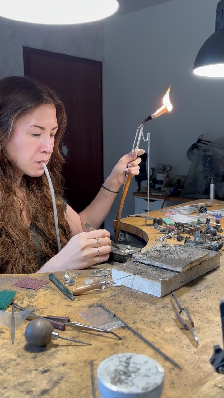
A torch at a workbench turns a quiet studio shot into proof of handwork. For a jewelry business owner, this builds the story behind the price tag without saying a word about hours or skill.
I would film during daylight from the bench’s far side, catching the flame and the jeweler’s focus in one frame. A phone on a small tripod handles this; no second person needed.
Keep clips short for Instagram Stories, or let the full loop run on Reels if the solder flow catches light well. The workbench clutter stays; it reads as real.
2. New Jewelry Pieces
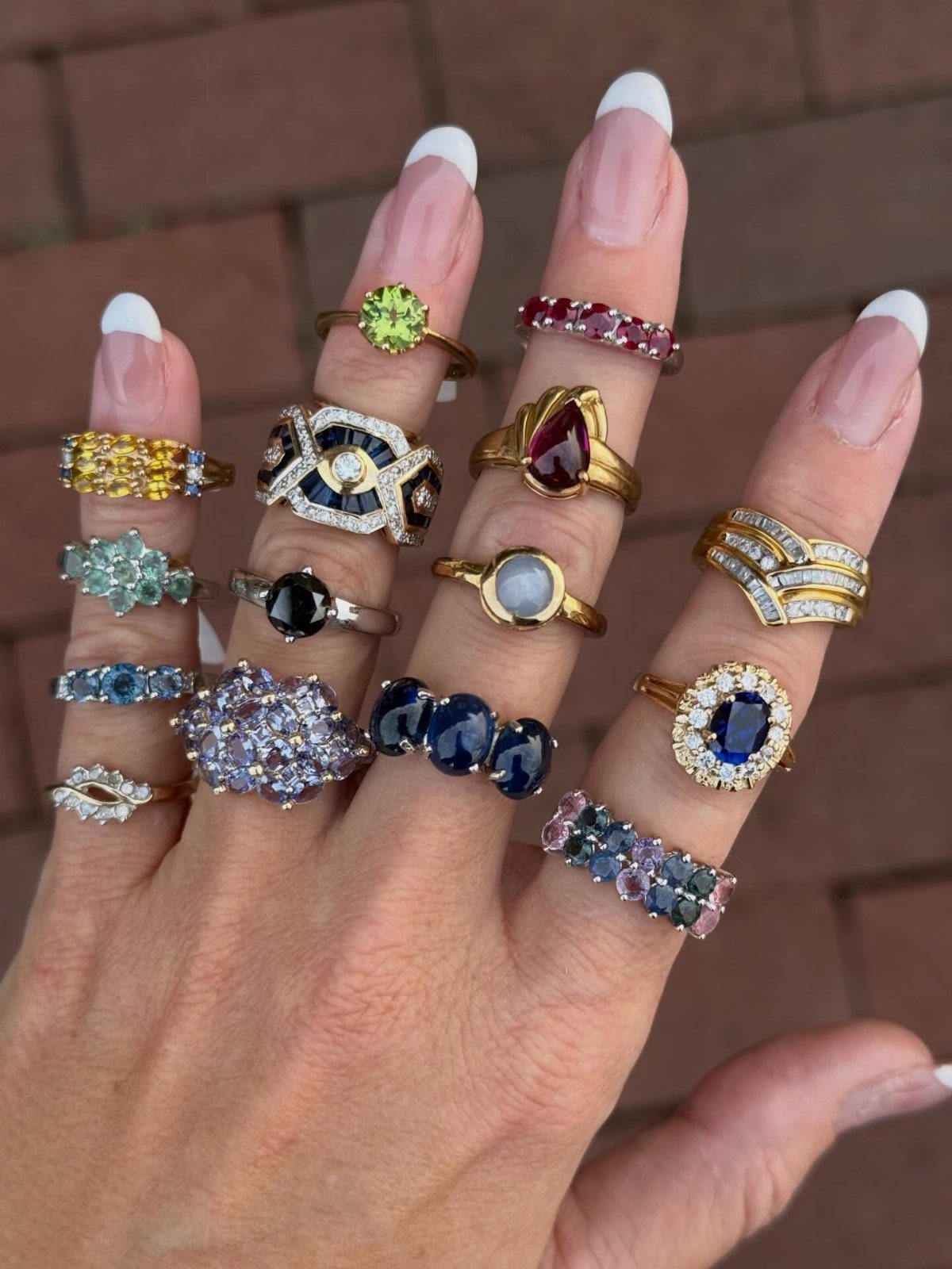
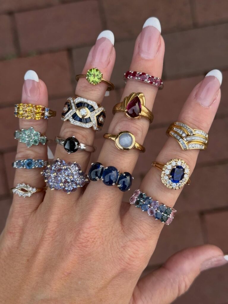
The wall’s warmth pulls out undertones in stones that a white background would flatten.
I like to shoot new drops this way because the hand sells scale and wearability together.
Shoot later in the day for the brick’s color to warm up. Tag the stones by name in caption, not karat weight; buyers remember "peridot" longer than they hold a number.
3. Customers Wearing Your Jewelry

A smiling customer near a window with yellow flowers gives you 3 trust signals: a real face, real light, and real life happening around the piece. This beats studio polish for conversion every time.
Ask buyers who tag you for permission to repost, but I find the better move is offering a small credit toward their next purchase for a fresh photo with their face in it.
Window light does the flattering work; tell your customers to face the glass, not stand with their back to it. Gold reads richer against skin in that soft side light.
4. Creative Looks Featuring Your Jewelry
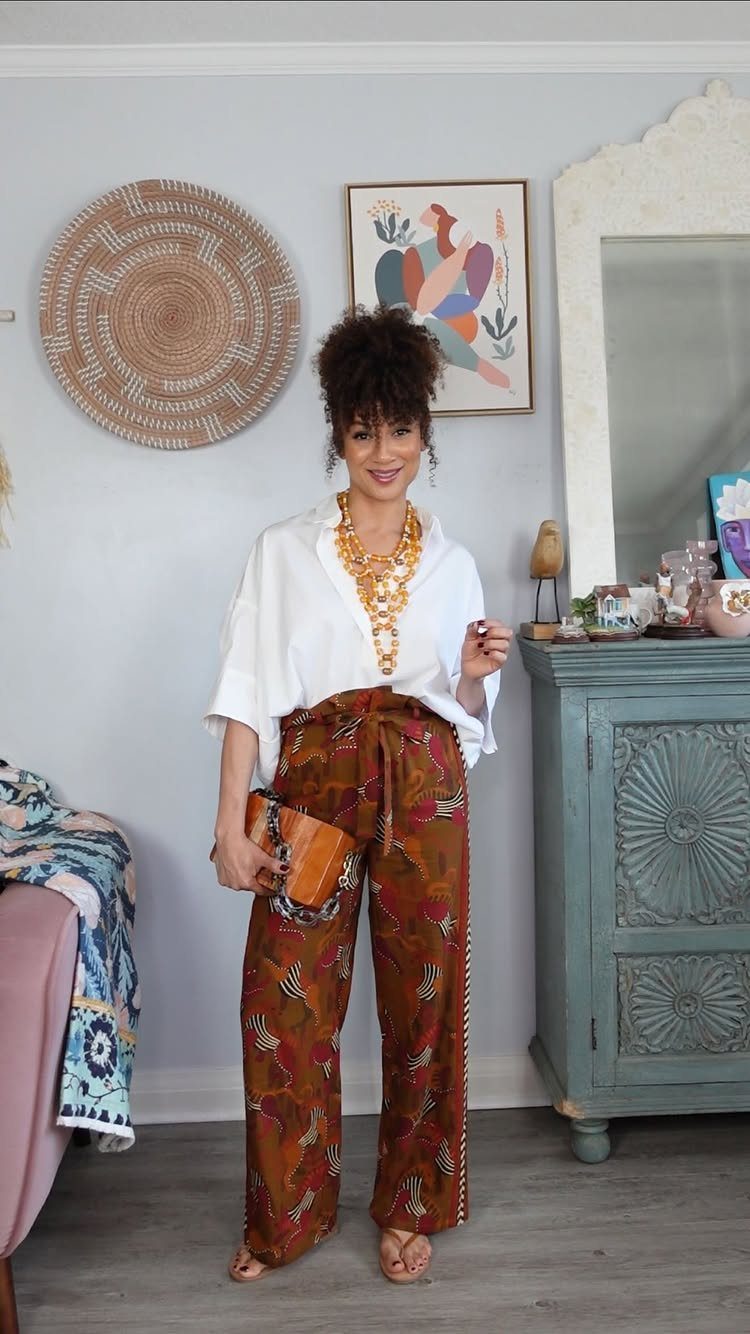
The blue cabinet behind her gives the eye somewhere to travel so the necklace does not carry the whole frame.
I shoot these with a full outfit budget from thrift; the jewelry should still read as the investment.
Patterned pants risk fighting the piece, so I keep the print in the same warmth family as the metal or stone. This look suits Instagram grid posts where the scroll stops on silhouette before the zoom on detail.
5. Interactive Content
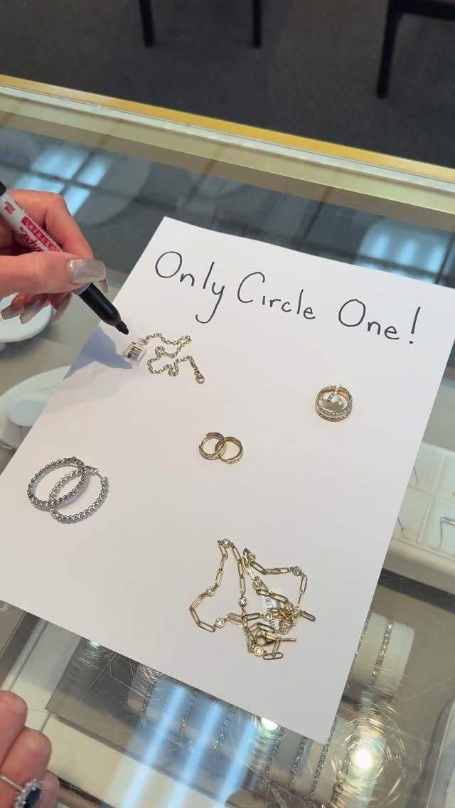
A poll drawn on paper with a marker turns passive scrolling into a decision the viewer makes. "Only Circle One!" with gold pieces laid flat gives the hand something to do and the algorithm a signal of engagement.
I have run these with a thermal label printer for the text; handwritten reads faster and friendlier. The paper should be standard letter size so the jewelry does not swim in white space.
Post to Stories, not the grid; the circle gesture is built for a thumb on a phone. Results posted quickly become your next content: the winner modeled, the losers archived as limited runs.
6. Local Fairs
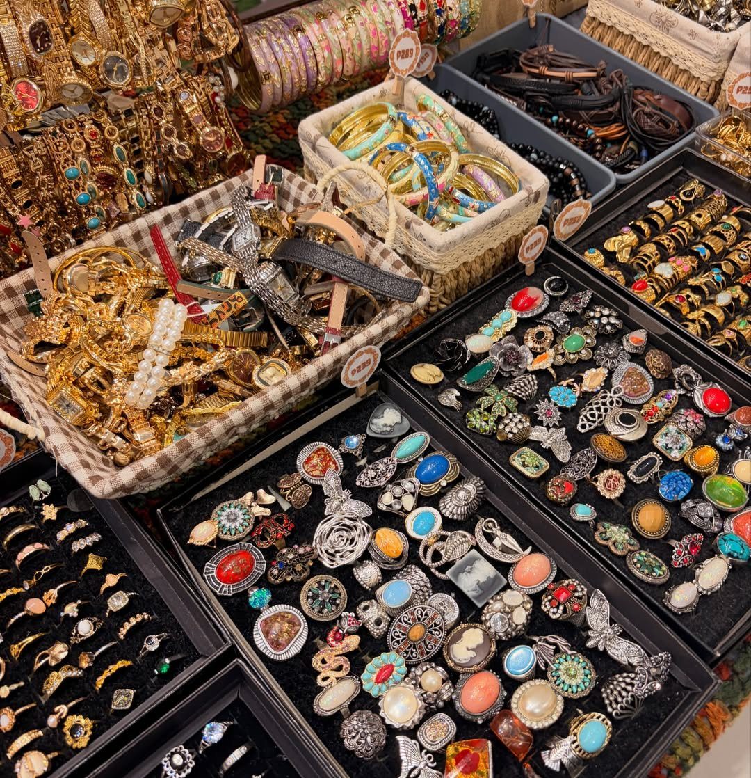
Baskets and trays at outdoor height, pink tags visible, turn a market table into browseable inventory. The angle matters: straight down collapses depth, so I shoot from shoulder height to let the eye travel across layers.
This content suits the business owner who sells direct and wants to signal availability.
Shoot early when shadows are still soft; later, silver reflects hot spots that read as cheap. One fair post per season is enough; more and you train followers to wait for in-person discounts.
7. Product Close-ups
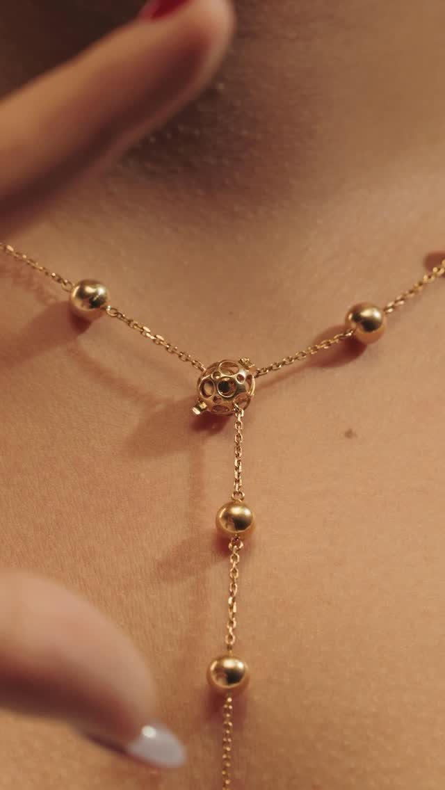
A close-up of a gold bead necklace with a central sphere, framed by the collarbones and the curve of hands, sells texture and weight better than any white-background catalog shot.
The skin provides scale and warmth that a ruler and a lightbox cannot.
A longer lens compresses the plane and lets the beads stack visually, which is why I reach for one when I want that layered look. Aperture at f/2.8 or wider isolates one focal point; the rest falls soft without disappearing.
8. Branded Packaging Displays
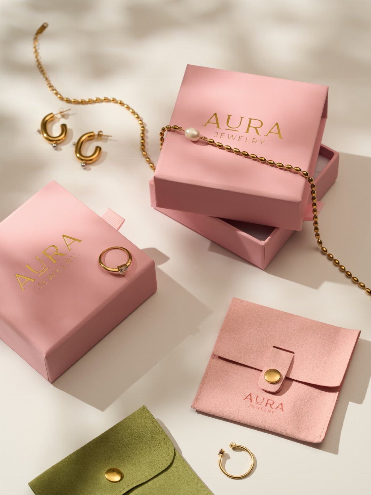
Pink and green boxes stamped with "AURA JEWELRY" turn an ordinary flat lay into proof of a finished brand. The packaging carries as much weight as the pieces for buyers who are gifting or buying their first serious piece.
I arrange these with the box slightly ajar, tissue trailing, so the unboxing moment is implied.
The white surface keeps the color story clean; colored backdrops fight the packaging design. One box open, one closed, one piece outside gives three depths of engagement in a single frame.
Post these before holidays when "ready to give" is the buying trigger.
9. Jewelry Staged on Trays
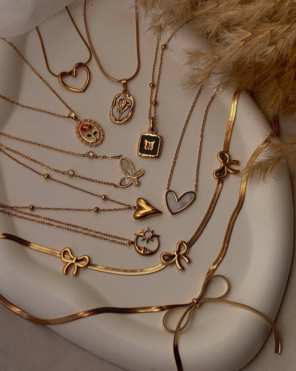
A white ceramic tray with dried pampas grass in the corner turns a tangle of gold necklaces into a composed still life. The tray’s rim contains the eye; the grass gives height and texture without stealing focus from the metal.
I lay chains so their pendants hang at different angles, not parallel. Parallel reads as inventory; staggered reads as personal collection.
The pampas should be paler than the gold, never greener; green competes with warm metal. Replace the grass seasonally, or omit it entirely if your shop leans modern.
This format works for shop updates and "new in" announcements where variety, not a single hero piece, is the point.
10. Unique Glass Display Styling
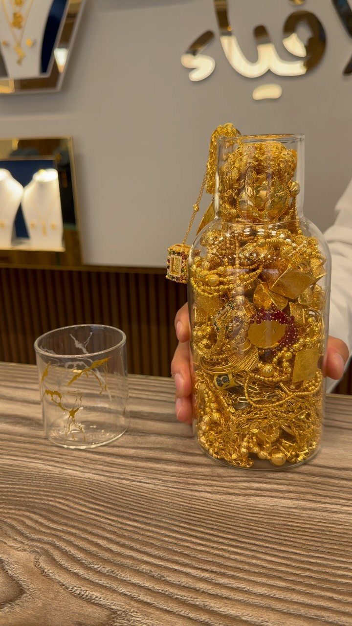
A clear glass bottle filled with gold chains, held above a wooden table, turns storage into spectacle. The glass distorts and magnifies; the hand implies scarcity, a private collection glimpsed by accident.
I use bottles with a narrow neck so the chains do not simply pour out when tilted for the shot.
The wood below should be matte, not varnished; reflection fights the glass’s own refraction. One small empty jar nearby suggests the collection is growing, not complete.
This suits Reels and TikTok where the motion of the lift and the rattle of metal gives the algorithm a sound signal to push.
11. Reflective Surface Flat Lays

Geometric gold earrings with pearls resting on mirror, catching a blue sky with clouds, give the viewer two images for the price of one: the piece and the weather that day.
That specificity stamps the post with a moment, not a catalog number.
I shoot these outdoors in open shade, never direct sun; hard light burns the reflection to white.
The mirror should be larger than the frame needs, so the sky dominates and the jewelry reads as interruption. Clean the glass with a lint-free cloth; every speck shows at this distance.
This format suits summer launches and vacation-themed drops where the mood is escape, not occasion.
12. Necklaces Layering Guide
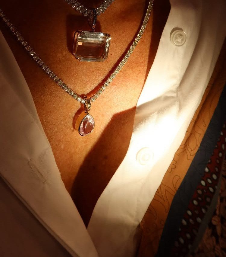
A white button-down shirt with two layered pendants, one rectangular clear stone and one teardrop pink, shows buyers how to wear rather than simply what to buy. The shirt’s placket gives a vertical line that separates the layers cleanly.
I order these by length with at least a 2-inch drop between clasps; closer and they tangle visually and physically.
The top pendant sits at the collarbone notch, the lower mid-sternum. Mixed stone shapes work better than matched; two teardrops read as accident, two different cuts read as intention.
Post these in January and September when customers are rebuilding a wardrobe and need the formula spelled out.
13. Behind-the-Scenes Digital Mockups
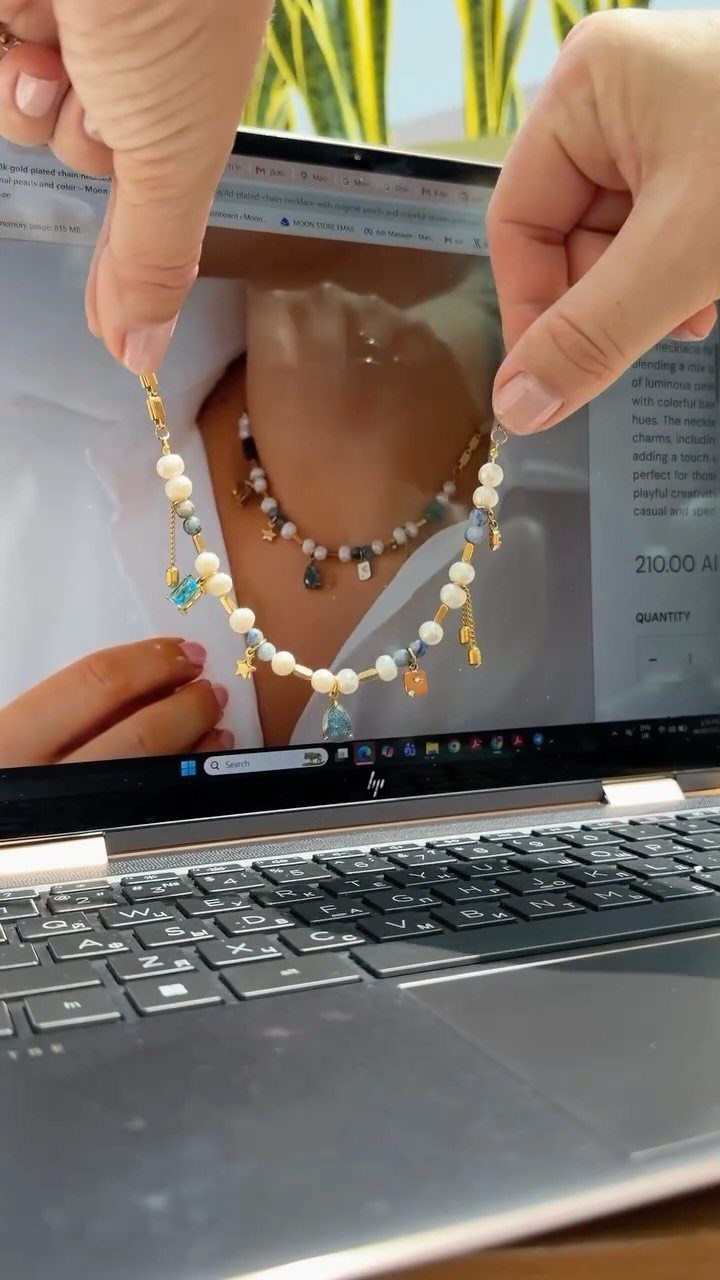
A physical piece held against its own product page proves the listing matches the object. I like this for new launches where buyers need reassurance that the photo and the mail will align.
Shoot with the laptop angled so both screen and necklace catch light; straight-on flattens the bead depth into pixels.
The keyboard in frame grounds it in real workspace, not studio fantasy. Post these to Stories with a swipe-up to the live listing while the product is still in stock.
14. Jewelry Held in Hand
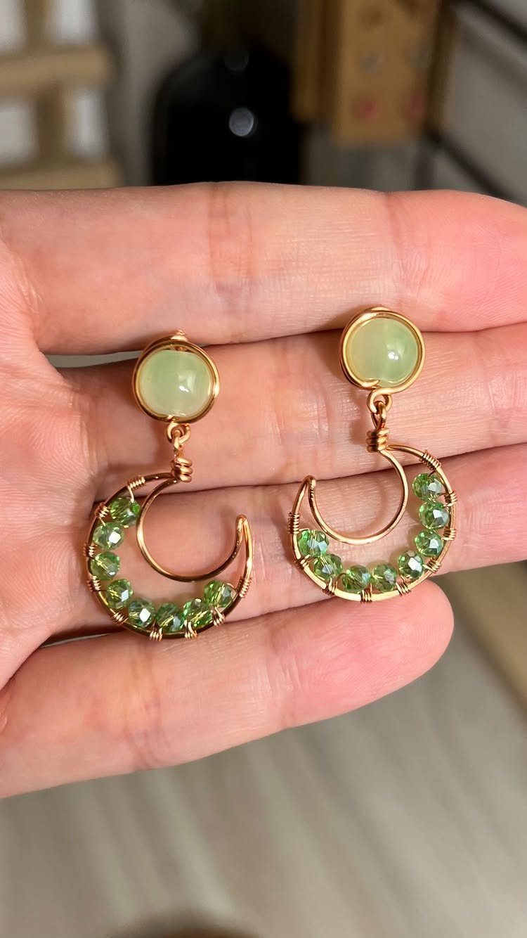
Skin texture and finger width give scale that a ruler would kill as romance. Green stones read truer against a palm than against any card or cloth I could choose.
Keep the background blurred to indoor softness so the metal edges stay sharp. This suits single-item announcements where the stone color is the selling point and the post needs no prop budget.
15. Casual Mirror Selfie Styling
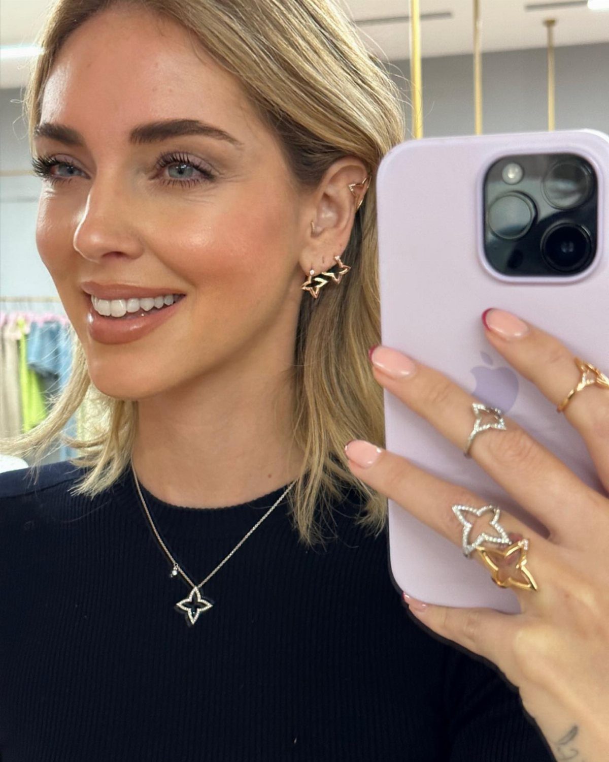
The purple phone and the star shapes signal a buyer in her 20s who shops her own feed. This reads as peer recommendation, not brand broadcast, which is why conversion runs higher on these than on polished model shots.
I would shoot in a bedroom with a door frame visible, never a bathroom; the mirror size and the light quality differ.
The phone covers part of the face, which is the point: the jewelry carries the identity, not the model. Post to grid, not Stories; the square crop lets the mirror frame hold the composition.
16. Outdoor Garden Setting
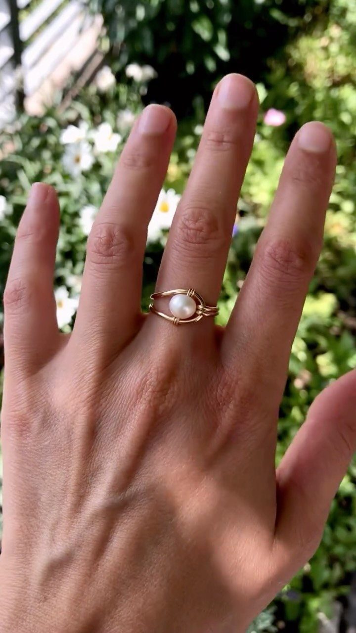
Pearl against green reads as fresh and unplanned, though the blur took planning. The ring becomes a find, not a pitch.
I shoot when sun filters through leaves to dappled softness; open sky burns the pearl to white.
The hand should move slightly so the background green shifts, proving the garden is real and not a stock blur. This format suits spring collections and Mother’s Day timing when growth and gift overlap.
17. Hanging Necklaces Display
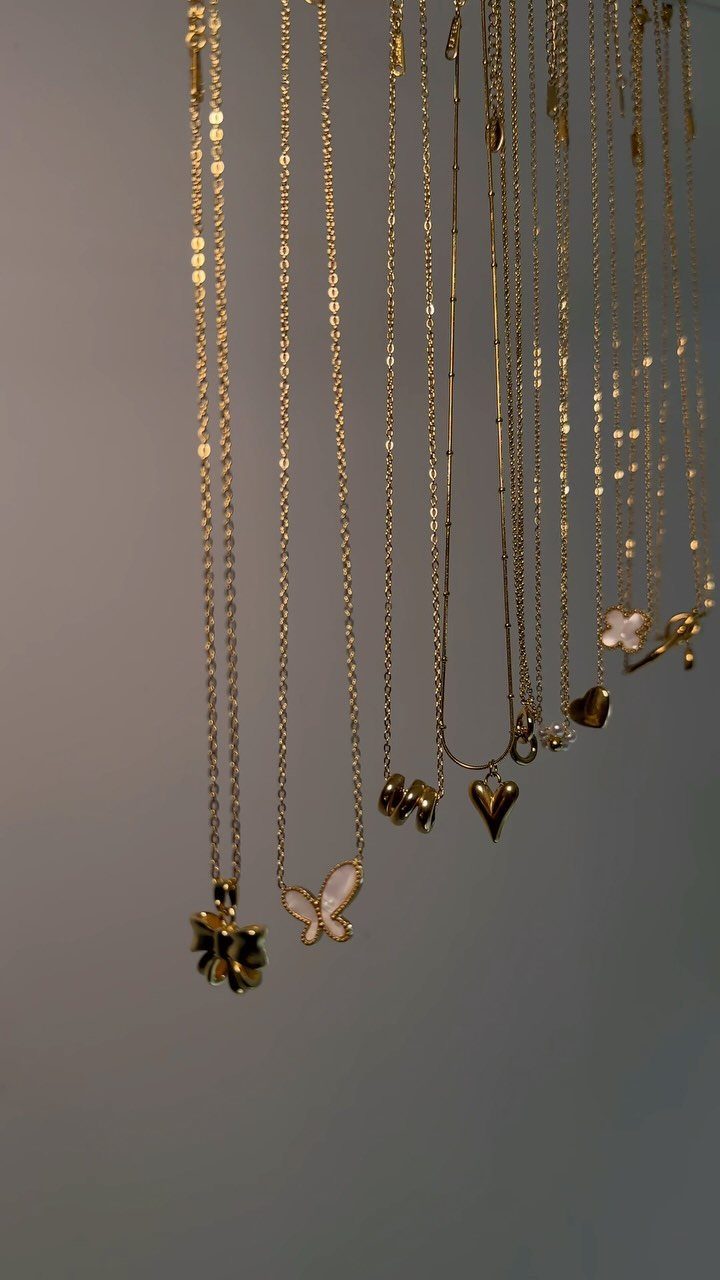
Vertical hang separates chains that would tangle flat and lets each pendant find its own air. The grey ground recedes so the gold reads first.
I space hooks far enough apart that pendants do not clump visually. The butterfly and heart charms work together because both carry sentiment; a geometric shape would break the mood.
This suits shop announcements with a small selection where variety, not depth, is the message. Keep the backdrop matte; any sheen competes with the metal.
18. Quote Napkin Flat Lay
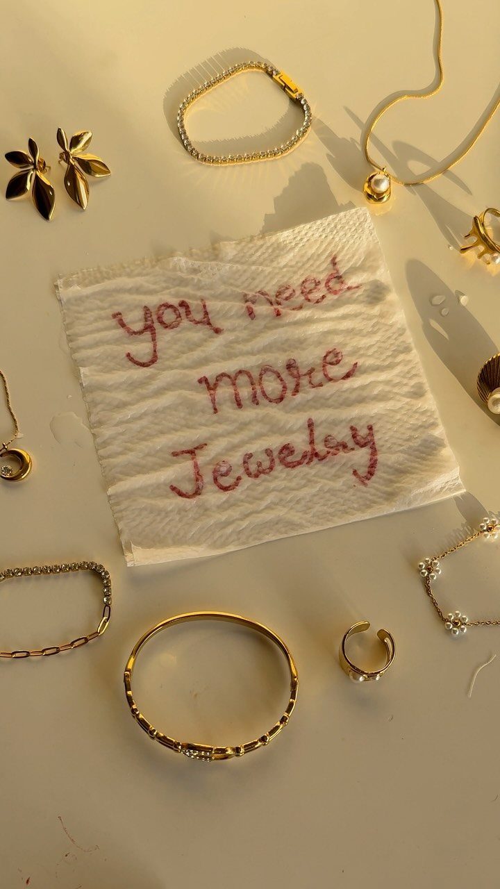
Red ink on white napkin against gold reads as café table, not catalog, which is the tone that sells impulse jewelry online. The handwriting should slope slightly; perfect script reads as font, and the joke dies.
I arrange pieces so the napkin sits off-center, not crowned; centered reads as deliberate brand, off-center reads as found moment.
The "more" in the quote does the work, not "need"; need pushes, more invites. Post these on Fridays when weekend treat-yourself spending peaks.
19. Flashlight Gemstone Glow Demo
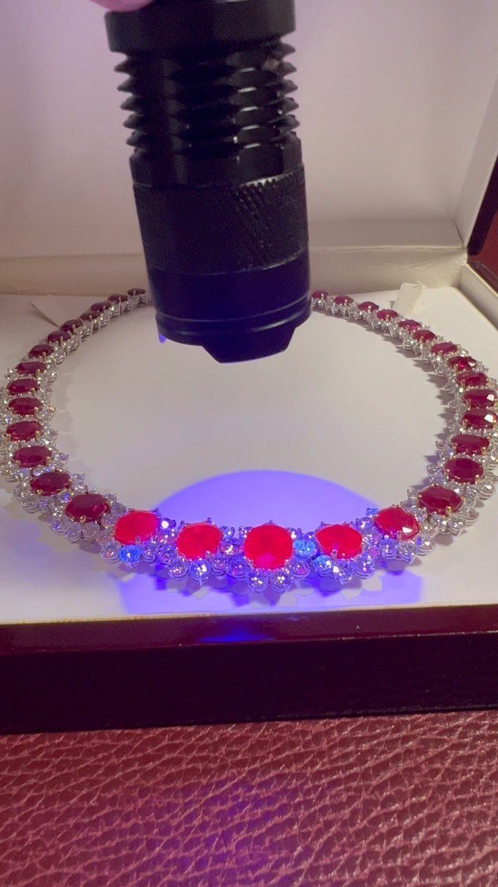
A flashlight beam through red stones in a white box proves what daylight softens: the gem’s body color and cut quality under controlled intensity. The black housing keeps the viewer’s eye on the stone, not the tool.
I use a single LED with a tight focus, not a phone flash; the spread is too wide and kills the drama.
The box interior should be matte white so the light bounces once and dies, not mirrors back. Shoot this as a Reel with the beam entering from darkness; the algorithm favors the contrast jump.
Post these to close a sale on a stone-heavy piece where the customer hesitates on color saturation.
Importance of Visuals
Instagram built its entire architecture around images, which is why jewelry performs there better than on text-heavy platforms.
Kendra Scott turned a local Austin operation into a national brand partly by pouring budget into lifestyle photography before competitors did.
The lesson is not to copy her color palette but to match her ratio: spend on visuals at the same scale you spend on metal and stone.
A phone camera handles this if you control the light.
Shoot near a north-facing window, use a white card to bounce fill, and edit for the metal’s true tone rather than the mood you felt. A viewer stops scrolling because the piece looks touchable, not because the filter surprised her.
Engagement Strategies
A comment left unanswered past the first hour is a lead gone cold.
I check notifications twice daily, morning and evening, and answer in the thread rather than a DM when the question is general enough to help the next reader.
Hashtags split between broad and specific: #handmadejewelry for reach, #goldbeadnecklace for the buyer already hunting. I use eight to twelve, never the thirty allowed; stuffing reads as desperate and trains the algorithm to bury you.
User-generated content needs explicit permission, not just a tag.
I message the customer, credit her handle in the caption, and send a small discount unprompted. The exchange builds inventory I did not shoot myself and proof I cannot fake.
Polls in Stories earn a reply from one in ten viewers. That ratio beats grid posts by triple; use them for quick decisions like chain length or drop timing.
Content Scheduling
Consistency matters more than frequency.
3 posts weekly on a fixed rhythm outperforms daily bursts followed by silence, because the algorithm reads gaps as abandonment. I plan one month ahead using a simple calendar: product, process, person, repeating.
Scheduling tools like Later or Hootsuite let me batch photography on Sunday and drip content through the week. The saved hour each morning goes into actual engagement, which no tool handles well.
Mix post types deliberately. A grid of nothing but product shots trains followers to scroll past; intersperse packaging, worn shots, and bench work so the eye meets variety.
I aim for one behind-the-scenes frame per four product images, a ratio that keeps the feed human without drowning the inventory.