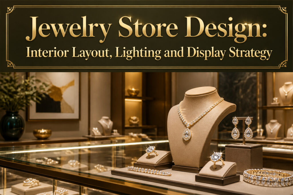
Jewelry store design is the deliberate shaping of interior space, light, and display to move a customer from hesitation to purchase.
The catch is that most owners overspend on cases and treat lighting as an afterthought, even though directed light on a gem measurably increases its perceived value.
A workable layout starts with four to five feet of aisle width, the minimum that keeps browsing from turning into a shoulder-brushing exit cue.
Open and Inviting Layout

Aisle width and counter height do more to shape how customers move through a jewelry store than almost anything else.
Four to five feet is the minimum aisle width that keeps traffic from bunching up during busy hours, and anything narrower turns browsing into a shoulder-brushing exercise that sends people toward the exit faster.
The standard counter height sits at three feet, which is low enough that seated customers do not feel towered over and standing staff can lean in comfortably to show pieces.
Most layouts that actually work divide the floor into three zones rather than scattering cases wherever they fit. The browsing area needs breathing room, wide aisles between displays so customers can circle back without blocking newcomers.
Consultation desks or seating areas belong slightly removed from the main traffic line, a place where someone trying on a ring is not in the path of someone headed to the register.
Checkout, meanwhile, should sit near the exit but not so close that the line pools into the browsing space and creates the same congestion the wide aisles were meant to solve.
Signage and mirrors placed at natural decision points help customers find those zones without staff intervention, which matters because the longer someone spends navigating comfortably, the longer they spend looking at what you are actually selling.

♐Extended Lifespan: Incorporating innovative frictionless magnetic cooling fan technology, Par30 LED lamps effectively reduce operating temperatures, extending their lifespan.

🔦【Adjustable & Flexible Spotlight Direction】This LED spotlight features a fully rotatable lamp head that swivels 360° horizontally and 180° vertically, allowing you to easily direct the spot light exactly where it’s needed. Perfect for highlighting jewelry, artwork, or collectibles with precision.

★Wattage:3W.Operating voltage:12V.Low 12 volt lighting product, safe work voltage for human being and generate less heat than traditional light bulbs, low power consumption. long life expectancy, lifespan is over 50,000 hours. Save effort and maintenance costs on changing bulbs frequently
Strategic Lighting

The first thing that goes wrong with jewelry store lighting is usually the temperature. Walk into a space lit too warm and the diamonds look yellow; go too cool and the whole room feels like a clinic.
LED color temperature between 3000K and 4000K hits the range where metals stay true and gemstones actually throw light back at you.
I learned this watching stores miss on one layer and fix it with another.
Ambient lighting sets the mood, task lighting keeps the sales counter accurate for close work, and accent lighting does the actual selling by picking out individual pieces. The layered approach matters because no single fixture can do all three.
LED strips inside cases are the standard move for accent, with tiny spotlights reserved for the pieces you want to stop traffic.
What convinced me, reading through a dozen of these builds, is how often owners overspend on the cases and treat lighting as an afterthought.
The psychology research on retail environments is clear: directed light on a gem increases its perceived value by making the stone shine and the metal more reflective. That is not decoration.
That is revenue.

Compact design: The diameter of the lamp body is only 0.8 inches, and the opening is 0.6 inches, which is very suitable for small space lighting in cabinets, display cabinets, and other embedded installations

8000mAh Rechargeable Picture Light - Neymlya battery operated picture light built-in 8000mAh long-lasting rechargeable battery, only takes 6 hours fully charge can provide 15 hours (maximum brightness) ~ 60 hours (minimum brightness) running time. Compared to others, our picture light comes with a longer 4.9ft(1.5m) 5V 2A fast charging cable, convenient to use even when plugged into outlet ensures uninterrupted lighting for your artwork if want

1 case of 12 Packs, 12 Count Total
Interactive Displays

Touchscreens and tablets placed at eye level near cases let shoppers pull up product details, view customizations, or read about craftsmanship without waiting for staff.
The interaction keeps them in the store longer and builds confidence in what they are buying. Virtual try-on stations take this further, using augmented reality to show how earrings or necklaces look on the customer’s own reflection.
That moment of seeing a piece on themselves often closes the sale.
The data these displays collect is just as valuable as the engagement. Customer preferences, most-viewed items, and customization patterns all feed back into inventory and marketing decisions.
A store that knows which virtual try-ons lead to purchases can stock and display accordingly.
Augmented reality and interactive screens belong in the mid-price and above segment, where the investment matches the average transaction size. Budget operators risk spending display dollars that never convert to sales.
Placement matters too: screens need to feel like assistance, not barriers between the customer and the jewelry itself.
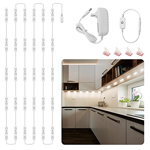
【DIY Flexible Design Display Lights】14ft ultra-bright white light strips, flexible for going around corners and easy to hide in the display cases. Good encircle and decorate any shape of display cases. Use of this kit is only limited by your imagination. And you can freely customize the length and cut at the end of the light. Great way to upgrade your display case lighting.

【An Easy Quick Upgrade for Kitchen】These under counter lights kit vastly improves not only the workability of your counters, but also it enhances the looks of your kitchen. They will transform your kitchen into a warm, welcoming space that you will enjoy cooking in.

HitLights RGB Strip Lights are only available in HitLights stores!
Comfortable Seating Areas

A velvet chair and a tiny round table in the corner changed everything for one small shop I read about. Customers sat longer, conversations turned personal, and high-value custom sales climbed.
Seating is where browsing turns into buying.
The placement matters. Chairs near consultation desks or display cases let a customer rest while they consider an engagement ring or compare settings.
They stop feeling rushed. Brown chairs work well against a white and brown palette, though matching to your overall color scheme is the safer move.
A small rug or different lighting can mark the nook visually so it does not blend into the traffic flow. Even two stools and a corner table suffice if square footage is tight.
The goal is the same: a spot where the body relaxes and the eye stays on the jewelry. Comfortable customers stay longer, see more pieces, and remember the experience warmly enough to return.

Under cabinet task lighting applications

Low Energy Consumption

EASY INSTALL DIY - long life 10 years or more, Brighten up any room with Under Cabinet lighting LED. This panel can be used to complete a job, or add to other Inspired LED panels
Thematic Decor Elements

Seasonal rotations keep a jewelry store from feeling like a static showroom.
Swapping displays for Valentine’s Day, birth months, or local events gives regular customers a reason to look again, and the timing itself does the persuading: engagement rings feel different in February, just as gemstone collections read as more personal when tied to someone’s birth month.
Thematic decor works the same way, but it needs restraint.
Rich colors and textures that echo the jewelry’s craftsmanship can deepen the story, yet the moment a motif starts feeling clunky or the art overwhelms the cases, the store tips toward novelty shop.
Sculptures, custom pieces, or heritage references should sit quietly enough that customers notice the jewelry first and the theme second.
What convinced me, reading through how stores handle this, is that the best thematic choices reflect something specific: local culture, a brand’s own origin, the actual hands that made the pieces.
Generic seasonal dressing, the plastic hearts in February and pumpkins in October, reads as effort the customer could have skipped. A single thoughtful element, rotated on a schedule, outperforms a dozen decorations that never change together.

Focused Display Light: This LED spotlight is designed for jewelry display lighting, showcase cabinets, and counter presentations, helping direct attention to small items in retail or home settings; the compact 9.05 x 2.75 x 2.59 in size makes it suitable for cabinets, shelves, and desk use, and the shipment includes 2 spotlights for paired placement

【Multipurpose spot light】Elevate your interior with our multipurpose spotlights – the perfect solution for accentuating and highlighting your cherished possessions. Whether it's artwork, plants, pictures,display case,cabinet,collectible toys, or jewelry, these accent lights are designed to draw attention to the items you hold dear.

【Multipurpose mini led spotlight】: The ideal solution for interior accent lighting, ideal for highlighting artwork, plants, pictures, toy models,jewelry etc,. They draw your attention to your items or anything else you want yourself or others to pay attention to.
Use of Technology
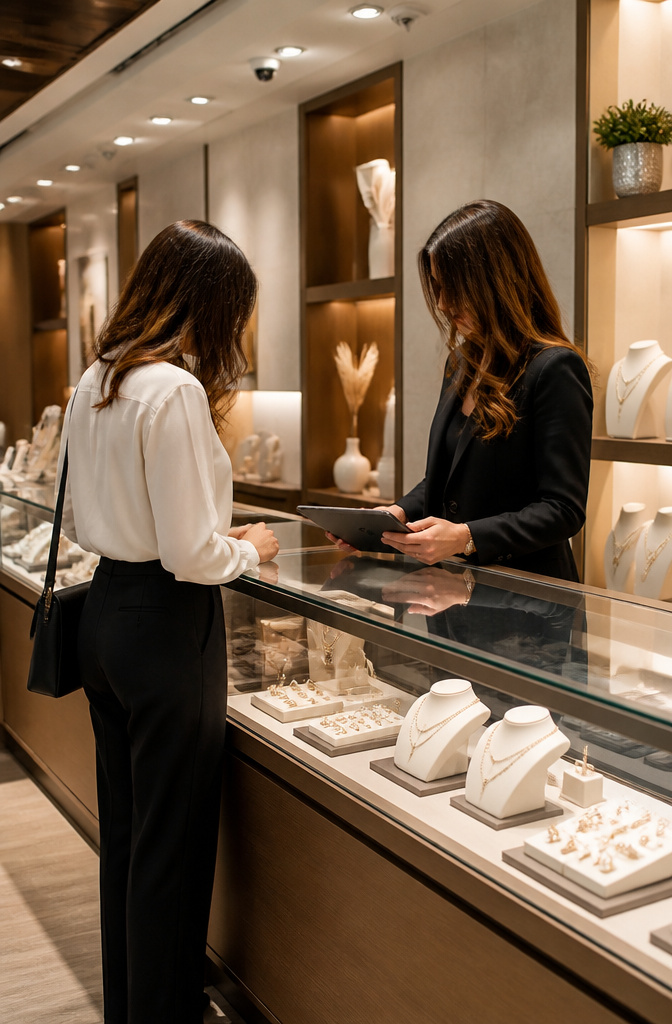
Operational technology shapes jewelry store design in ways shoppers never notice until it fails.
A modern point of sale system sits at the counter, speeding up transactions while storing purchase histories that let staff pick up where the last visit left off. That continuity feels personal without demanding anything from the customer.
Behind the cases, inventory management software tracks what sells and what sits, which means the pieces on display are usually the ones people actually want to try on.
Custom orders and repair workflows run through the same system, so a salesperson can answer status questions on the spot instead of disappearing into the back room.
Security logs operate quietly in the background, automated enough that staff do not have to choose between watching shoppers and helping them.
The balance matters: visible cameras reassure, but a system that requires constant manual attention pulls focus from the merchandise.
The trick is burying the wires and screens so the technology serves the atmosphere instead of dominating it.
A tablet at the counter should read as a sleek object, not a computer; readers and scanners belong below the surface line of the case.
When the tech is integrated well, the store feels modern without feeling like an electronics showroom.

High-grade Material for Long-Term Use: Our display spotlight is well-made and adopted fine quality material, ensuring it provides you with long-term use. It is designed to withstand the wear and tear of daily use, providing reliable and practical lighting

UL listed 12v Power supply to ensure the highest quality that can last. perfect for your trade show, jewelry, watches, decor, retail store, and more.
♐Extended Lifespan: Incorporating innovative frictionless magnetic cooling fan technology, Par30 LED lamps effectively reduce operating temperatures, extending their lifespan.
Grand Entrance

The entrance does two jobs at once, and most stores only notice one. A grand entrance can leave a lasting impression and draw people to explore the offerings.
That is the visible half. The other half is what happens in the customer’s head as they cross the threshold.
The initial space you enter is the decompression zone. Customers are transitioning from the busy outside world, and this area needs to stay free and uncluttered.
Do not force many products upon them. The only thing they can see is a showstopper such as a planter with flowers, a single display item on a stand, or a sign that welcomes them to the shop.
In this way, customers get that moment of reflecting their changes before they start with shopping.
Two ways to play this. One source favors pots before the entrance and a sofa in the entry area, building a welcoming space that invites lingering.
The other keeps the zone nearly empty, using a single planter or display as a palate cleanser between street and store. The sofa approach risks clutter; the empty zone risks feeling cold.
For a jewelry store where the product is small and the price point makes hesitation natural, the empty zone wins. The customer needs that breath to shift from "walking past" to "considering buying."
A planter with flowers handles the warmth without the bulk of seating that blocks traffic and traps indecision.
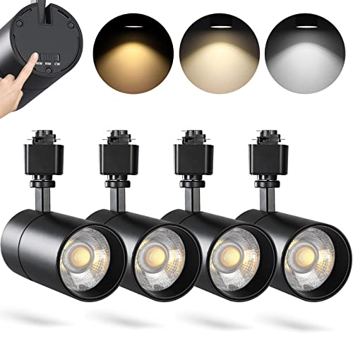
3 COLOR SELECTABLE: Possibility of selecting color temperature for each track light:3000k warm white, 4000k neutral white, 5000K day light

5 Selectable Color Temperatures: ALAMPEVER j type compatible track head choose from 2700K / 3000K / 3500K / 4000K / 5000K, giving you the flexibility to match different spaces and desired lighting effects with ease. Set your preferred tone before installation to ensure the perfect ambiance for different rooms or projects

8000mAh Rechargeable Picture Light - Neymlya battery operated picture light built-in 8000mAh long-lasting rechargeable battery, only takes 6 hours fully charge can provide 15 hours (maximum brightness) ~ 60 hours (minimum brightness) running time. Compared to others, our picture light comes with a longer 4.9ft(1.5m) 5V 2A fast charging cable, convenient to use even when plugged into outlet ensures uninterrupted lighting for your artwork if want. We suggest use 5V 2A+ charger for fast charging (not included)
Elegant Display Cases

Glass cases do the heavy lifting in any jewelry store design, but the real difference comes from how you tier what’s inside them.
Rotating displays and stepped trays lift necklaces and rings toward the eye instead of flattening them on a single plane.
Aisle width matters here: keep four to five feet clear so customers can circle a case without brushing against it, because the first instinct when bumped is to step back from the merchandise.
Wall shelves paired with glass counters catch pieces from multiple angles, which sounds obvious until you watch someone spot a bracelet from across the room that they would have missed at counter height alone.
Grouping similar items together still leaves room for focal points that pull the gaze through the space.
Security sits inside the display itself. Lockable showcases with secure hardware are non-negotiable for high-value stock, and the best ones integrate LED lighting aimed at the gems rather than flooding the whole case.
The glass should be ultra-clear, not the slightly green standard grade that mutes a diamond’s fire.
Tall tower units or recessed wall niches work for statement pieces, though freestanding pedestals need anchoring and sight-line planning so staff can monitor every surface.
What convinced me, reading through the fixture options that actually sell in this market, is that the case is not just a container.
It is the only thing standing between your inventory and a grab, and the only thing framing it for a yes.
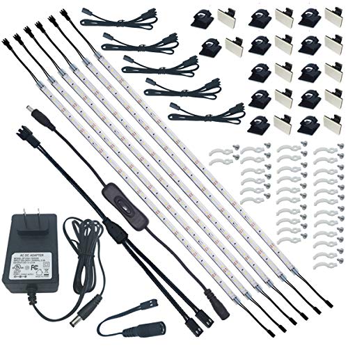
Easy Installation. The super strong self-adhesive tape on the back, mounting clips and screws, small extension cables and connectors and cable tiers will help you to install those very slim flexible LED light strip quickly. And all the parts can be well hided easily.

[Storage and Mirror in One] With this 2-in-1 jewelry cabinet, you get a 14.6" x 26.4" large frameless mirror and tons of storage behind it, which saves you space as well as time by allowing you to pick, wear, and check out matching jewels all in one place

Enhanced V-Shape Design: Upgraded light bars feature the iconic V-shaped design that adds elegance and provides seamless, invisible lighting, creating a stunning illumination effect that transforms your space
Artistic Wall Textures

Wall textures in a jewelry store do more than fill space behind the cases. They set the temperature of the whole room.
A flat coat of neutral paint reads clean and bright, which works as a canvas, but it stays quiet to the point of disappearing.
What convinced me, reading through a dozen of these store builds, was how a single textured wall shifts the customer’s sense of what they are walking into.
A fluted wood panel or a stretch of Venetian plaster gives the eye something to rest on that is not merchandise, and that distance actually makes the jewelry feel more precious. The sources split on how far to take this.
One approach goes for marble-effect surfaces across a full wall, aiming for that high-end gallery hush.
The other keeps texture small and touchable: a raw silk bust, a velvet cushion, a single accent wall with brushed brass hardware catching the light nearby. Both work, but they serve different budgets.
The full marble effect costs more and commits the room to a single formal note.
The smaller touch lets you spend the real money where hands meet metal, on cabinet pulls and door handles in polished nickel or matte black, while keeping walls simple elsewhere.
The mistake I kept seeing was texture competing with the display instead of backing it. Shiny gold wall patterns looked lush in photos, then swallowed the actual pieces under spotlights.
The fix is restraint: one textured plane, neutral in tone, with the metallic finish reserved for fixtures the customer touches directly.

✅ BULLNOSE DESIGN - ASD 120V LED under cabinet lighting hardwired features a sleek bullnose profile, smooth dimming from 10% to 100% with compatible LED dimmers, and three selectable color temperatures: 3000K (Soft White), 4000K (Cool White), and 5000K (Daylight)

[ Ultra Bright & Energy Saving ] 5W, 450LM LED under-cabinet light offers a 4000K-4500K natural white glow, suitable for kitchens, closets and shelves. Includes a dimmer switch and a 12V 1A power adapter

✅ BULLNOSE DESIGN - ASD 120V LED under cabinet lighting hardwired features a sleek bullnose profile, smooth dimming from 10% to 100% with compatible LED dimmers, and three selectable color temperatures: 3000K (Soft White), 4000K (Cool White), and 5000K (Daylight)
Reflective Surfaces

Mirrors do two jobs in a jewelry store, and only one of them is for the customer. The other is for the wall behind her.
A well-placed mirror doubles the visible depth of a narrow floor plan by reflecting the opposite wall back at the shopper.
In a small store this matters more than almost anything else; light and reflection work as a pair to erase the feeling of barriers.
The mirror catches whatever daylight or fixture light already exists and pushes it farther into the space, so the store reads as open rather than crowded.
Material choice matters here because the mirror itself is only half the system. A thin metal frame in brass or matte black keeps the edge from visually swallowing the reflection, which is what a thick wood border tends to do.
I have seen stores where the mirror was framed in the same stone or textured material as the counter, and the effect flattened; the eye stopped at the frame instead of traveling through.
For the customer, the mirror is where the sale actually happens. She sees the piece on her own neck or wrist from angles the case never shows, and she stays in the space longer because she is occupied with herself.
Place one where the light is kind, not where it is merely bright. Harsh reflection ages everyone, and the goal is confidence, not scrutiny.
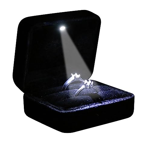
Premium material: This ring box is made of Premium, soft velvet interior and exterior better protect your jewelry. Square style design makes your ring box look Unique and Elegant. Great for special occasions like Proposal, Engagement, Weddings, Birthday, and Anniversary...etc. Also you can use it as small jewelry storage box for ring, pendant, earings, brooch or pin, even coins, or anything sparkle to display.

Display Cabinet Light-- , resistant against, easy to use. Eye protection, low consumption.

Long-Lasting Rechargeable Spotlight: Powered by a built-in 5500mAh rechargeable battery, the EZVALO indoor spotlight provides up to 25.5 hours of continuous lighting at full brightness, with longer runtime at lower brightness levels. Delivering up to 100 lumens of soft, glare-free illumination, it fully recharges in about 5 hours via USB-C. Ideal for highlighting plants, trees, artwork, gallery walls, display cabinets, collectibles, shelves, and home decor.
Subtle Branding

The strongest jewelry store design lets the brand arrive in pieces rather than announcements.
A curved arch above an illuminated logo wall does the work of a billboard without the shouting; it anchors the eye, then steps aside for the product.
Repeated built-in arches scaled evenly across the wall read clearly from a distance, each niche lit with a dedicated beam centered and trimmed to match the shelf below. That restraint is the point.
The palette stays neutral, the proportion controlled, the circulation deliberate. A brand that wants to be photographed and remembered does not need loud decoration to carry identity.
Seating stays low and soft, reception chairs curved and textured to sit flush against the desk face, pastel upholstery offering gentle contrast against the quiet backdrop.
Every decision reinforces the next, from ceiling height to layout sequence, so the customer remembers the feeling rather than the logo.
Small Store Layout Moves

Vertical space is where small jewelry stores win back square footage they do not have on the floor.
Slim fixtures that reach toward the ceiling draw the eye upward and keep the central aisle open for customers to move without brushing cases.
The standard aisle width runs 1.2 to 1.5 meters (about 4 to 5 feet), which is enough for two people to pass comfortably but tight enough that bulky fixtures kill the flow immediately.
The vault is the one piece you cannot shrink to fit. Even in a compact store, the workable minimum stays 2×2 meters (6.5 by 6.5 feet).
That is roughly the footprint of a small bathroom, and I have seen owners try to shave it down to squeeze in one more display case.
The result is a fire-code headache and a safe that cannot open fully when inventory is pulled at closing.
A standard safe at 300–600 kg already limits where the floor will bear it; plan the vault early and build the displays around that fixed point rather than the reverse.
What Stores Cost to Design and Build

A basic but professional jewelry store fit-out runs $75 to $200+ per square foot, and where you land in that range depends on your location, your materials, and whether you bring in a professional designer.
The spread is wide enough that a 500-square-foot shop could cost anywhere from $37,500 to over $100,000 before a single bracelet sits in a case.
Small spaces do not necessarily mean small bills. A compact footprint demands the same security infrastructure, the same HVAC, and often more custom millwork to make every inch perform.
The advantage is that your money concentrates. A few square meters of premium finish reads as intimate luxury rather than cramped corners.
If the budget tightens, the two places to protect are lighting and display showcases. Dim cases kill perceived value faster than plain walls ever will, and flimsy fixtures read as temporary.
Everything else, from wall treatments to seating, can tier up later when revenue justifies it.
Light and Color Choices That Work

The walls in my first store were a deep burgundy I thought looked expensive. It swallowed the room whole.
Switching to an off-white with a warm undertone opened the space immediately, and the cases finally became what customers noticed first.
Light neutrals, soft grays, and warm beiges do more than enlarge a small footprint. They reflect light rather than absorb it, which matters when every square foot counts.
A dove gray backdrop lets gemstones read as the color in the room instead of competing with it.
I learned the hard way that decluttering is part of the color strategy. Too many display materials, too many props, and even the cleanest palette starts to look like noise.
Stripping back to a single neutral surface per case forces the eye to the jewelry itself, and that restraint reads as confidence in the product’s value.
For lighting, adjustable spotlights on the cases paired with softer ambient wash overhead keep the space from feeling clinical.
Natural light through a window or skylight adds vibrancy when you have it, though the spotlights do the real work of making stones catch and throw light.
The accent rule holds: one brand color, used small and precisely. A teal logo wall behind the register, not scattered through every display.
The neutral field does the selling; the accent only marks where you are.
Security in Open Plans

Small open-plan jewelry stores face a real tension. You want the floor to feel accessible, but every corner out of sight is a liability.
The layout itself can help. Position the sales counter with a clear view of both the entrance and the full sales floor, and avoid arranging fixtures so they create blind spots where someone could stand concealed from view.
Camera coverage matters, yet the quality of the cases you choose matters just as much. A good camera system is essential, but it pairs with showcases that actually lock.
Reinforced glass and discreet panic buttons integrated into the design keep the security visible to you without broadcasting it to every customer who walks in.
Vault sizing runs practical for small footprints, around 2×2 meters or 6.5×6.5 feet, with standard safes in the 300–600 kg range depending on your inventory load.
What convinced me, reading through how these stores get laid out, is that the storefront itself does security work. Pale interior surfaces reflect daylight back through open shelving, keeping the interior legible from outside under both human and camera scrutiny.
The store performs as watched space without ever feeling like one.
Sensory Details Beyond Sight

Sound and scent are the two senses jewelry stores most often forget, and the ones customers notice least until they are done well. The right background music should sit low enough that conversation never requires a raised voice.
Classical or ambient instrumentals work; anything with lyrics competes with the sales dialogue you actually want happening.
I have walked out of stores where the playlist was too aggressive, not because the jewelry disappointed but because the tension in the room became palpable.
Scent is harder to get right and easier to overdo. A faint, clean smell, something like light linen or subtle citrus, signals care without announcing itself.
The mistake is choosing anything sweet or heavy, which reads as trying to mask a problem or, worse, triggers headaches in the small enclosed space of a private viewing room.
One jeweler I spoke with runs the HVAC through a diffuser loaded with a single essential oil, changed seasonally, and keeps a backup system for days when staff report even a hint of fatigue from it.
That kind of maintenance discipline, checked weekly rather than set and forgotten, is what separates the stores people remember from the ones they merely pass through.
Frequently Asked Questions
How do I make my jewelry look more valuable in a small store?
Focus on lighting and decluttering.
Directed LED light between 3000K and 4000K on a gem increases its perceived value by making the stone shine and the metal more reflective, while a stripped-back neutral surface per case forces the eye to the jewelry itself.
Adjustable spotlights paired with softer ambient wash keep the space from feeling clinical, and removing excess props reads as confidence in the product’s value.
What is the best color for a small jewelry store?
Light neutrals, soft grays, and warm beiges work best. An off-white with a warm undertone opens the space immediately and lets the cases become what customers notice first, reflecting light rather than absorbing it in tight quarters.
A single brand color used small and precisely, such as a teal logo wall behind the register, marks your identity without competing with the gemstones.
How can I improve security in a small, open-plan jewelry store?
Invest in high-quality, lockable jewelry showcases and a good camera system.
Position the sales counter with a clear view of both the entrance and the full sales floor, avoid fixtures that create blind spots, and use reinforced glass with discreet panic buttons integrated into the design.
Pale interior surfaces reflect daylight back through open shelving, keeping the interior legible from outside under both human and camera scrutiny.
What’s the biggest retail shop interior design mistake to avoid in a small jewelry store?
The biggest mistake is clutter. Overcrowding the space with too many display cases, too much product, or bulky furniture makes it feel cramped and cheapens the perceived value of your jewelry.
Prioritize clear pathways and minimalist displays so the eye lands on the pieces themselves rather than fighting through visual noise.
How much should I budget for the interior design of a small jewelry store?
A basic but professional fit-out runs $75 to $200+ per square foot, meaning a 500-square-foot shop could cost anywhere from $37,500 to over $100,000 before inventory. Location, materials, and whether you hire a professional designer all move the needle.
If budget tightens, protect lighting and display showcases first: dim cases kill perceived value faster than plain walls, and flimsy fixtures read as temporary.