Jewelry brand logos range from a few pennies per unit for gold foil stamping on black cardstock to the thousands a custom lettering artist charges for heritage script.
Where your customer encounters the mark first changes everything: across a mall corridor, Pantone 1837 does the selling before the name appears, or inside an unboxing, where foil catches light at thumb-height.
One concrete detail makes the difference: Tiffany trademarked its blue as 1837, the year the company opened, and uses no other blue anywhere.
1. Tiffany & Co Blue Box Logo
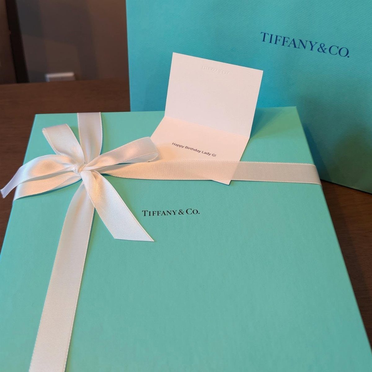
The Tiffany blue box works because the color alone does the selling.
Pantone 1837, trademarked by the company, shows up on everything from shopping bags to the white ribbon that finishes their boxes, and shoppers recognize it from across a mall corridor.
A serif wordmark in black or white sits quietly on top, never fighting the blue for attention.
For a designer building a brand, this is the lesson: pick one color and own it completely.
The box costs more than plain cardboard, but the unboxing becomes the advertisement. I would spend the money on custom packaging before I spent it on display ads.
2. Chopard Cursive Script Logo
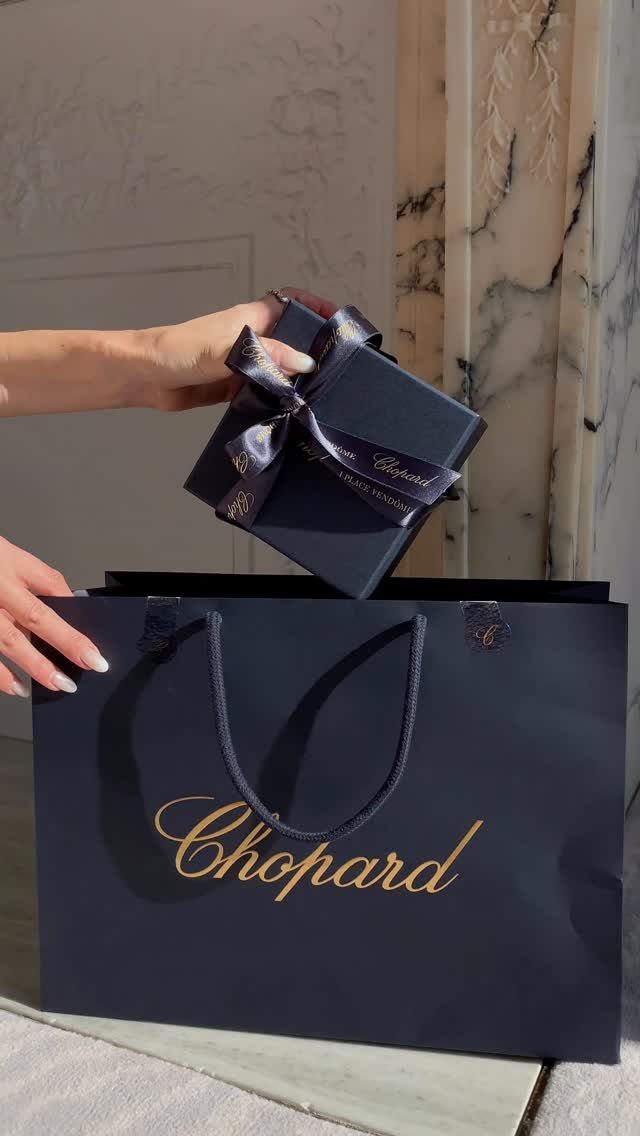
Gold cursive on navy reads luxury faster than any symbol could.
Chopard’s script flows without breaking, thick in the downstrokes and hairline thin coming up, the way formal penmanship used to be taught. The navy ground keeps it from feeling dated; gold on cream would look like a wedding invitation.
The technique works for a small jeweler who wants to signal heritage without commissioning a crest.
A custom script from a lettering artist runs thousands of dollars, or a modified existing font with licensing costs far less. Navy bags and boxes stock standard at most packaging suppliers.
3. Swarovski Swan Logo
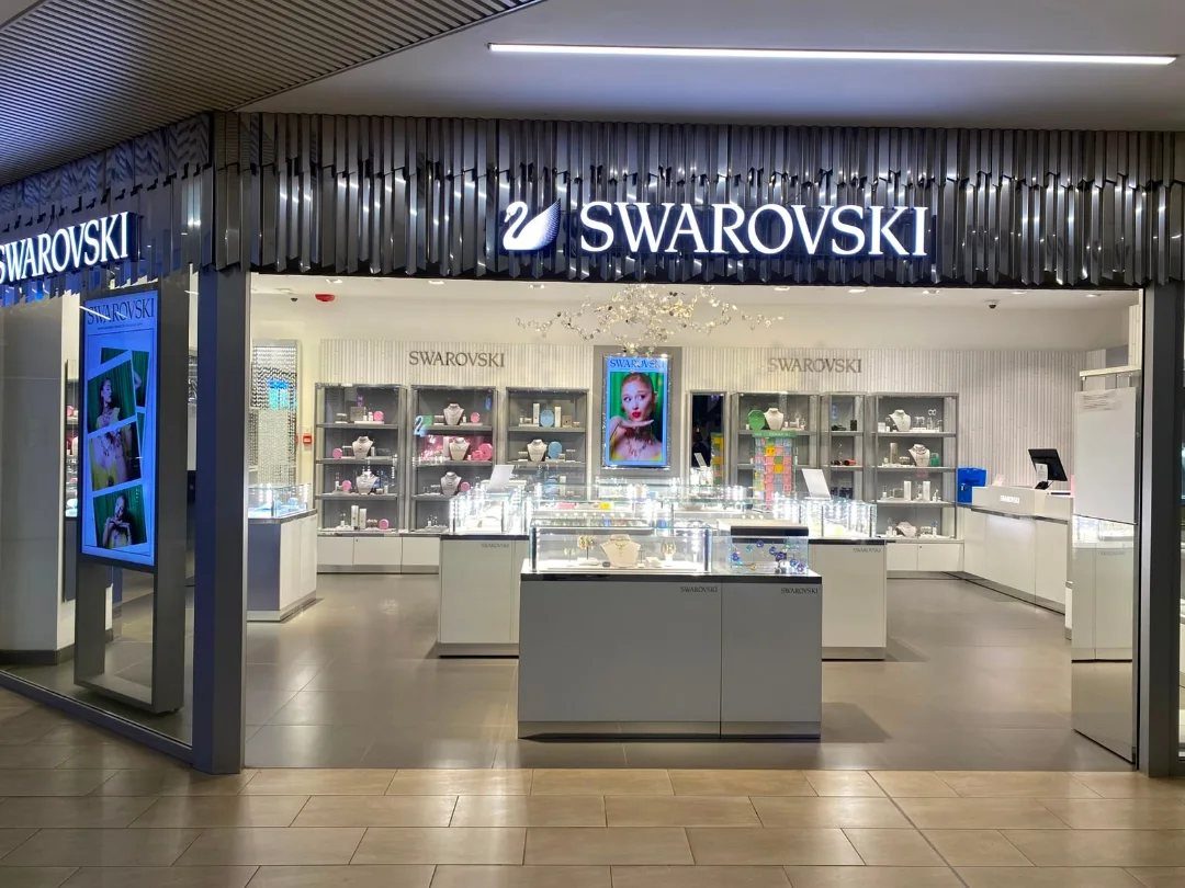
A swan silhouette gives Swarovski the symbol Tiffany got from a color. The bird faces left, neck arced, and reads clearly at the size of a pencil eraser on an earring back or blown up large on a store facade.
White illumination against dark surroundings is how the brand presents it in retail.
The form suggests grace without saying it, and the single color treatment keeps reproduction cheap and consistent. For a brand considering an animal mark, the swan proves that profile view beats full body; one angle is enough.
4. Kay Jewelers
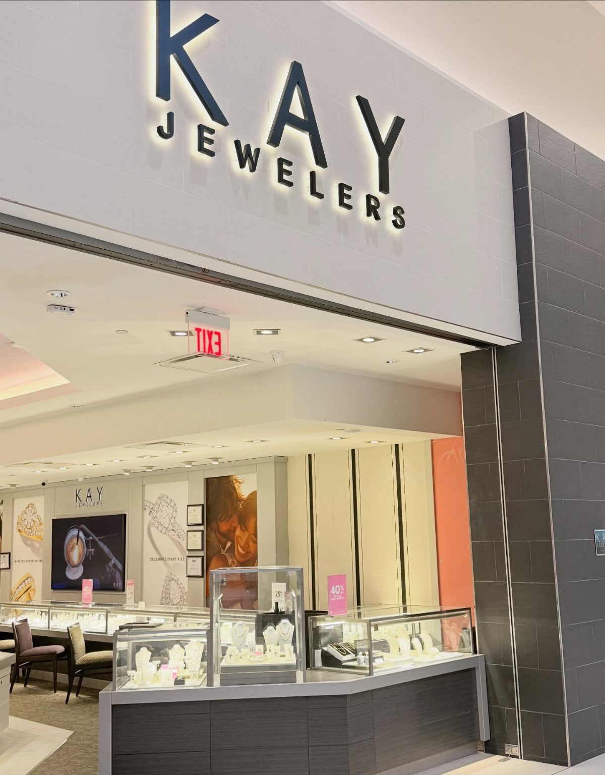
Kay Jewelers built recognition with a simple black wordmark on white, no symbol to memorize.
The letters are rounded, friendly, the kind of typeface that lowers the threshold for a first-time buyer walking past in a strip mall. Inside, bright cases and fluorescent light complete the accessible atmosphere.
The logo does not compete with the merchandise; it gets out of the way.
For a mass-market chain, that is the right call. I would not copy this for a custom studio, but for volume retail it performs exactly as intended.
5. Zales Jewelry Logo
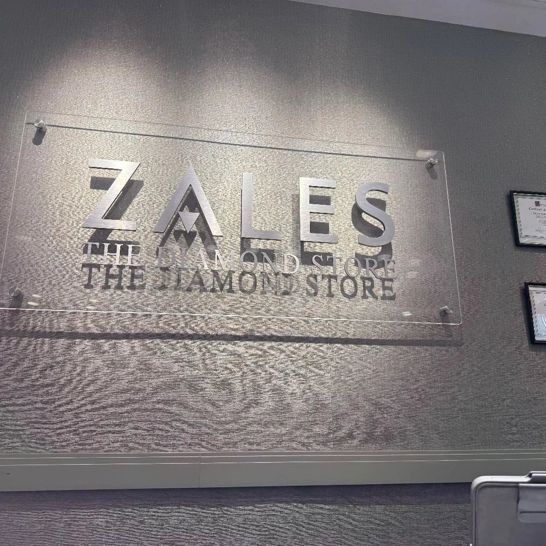
Zales pairs its name with "THE DIAMOND STORE" in smaller caps underneath, a subtitle that leaves no doubt what you are shopping for.
The silver finish on clear acrylic reads modern and clean, and the grey wall behind it stays neutral so the metal catches what light there is.
The two-line lockup takes more space than a symbol would, but it converts browsers who are not yet brand-loyal.
For a specialty retailer, spelling out the category can outperform mystery. I would test removing the subtitle after the brand is established, once the name alone carries meaning.
6. Crown Emblem Logo
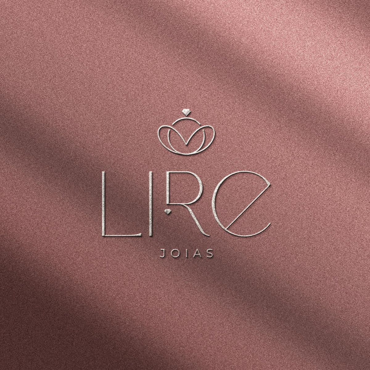
A crown above block capitals hits a register between royalty and hip-hop, and the rose-gold glitter ground pushes toward the latter.
The silver crown and metallic background compete for attention; I would choose one finish and let it breathe.
For a jeweler targeting a younger customer who wants conspicuous luxury, the crown emblem works. For quiet wealth, it overstates.
7. Bvlgari Serif Wordmark
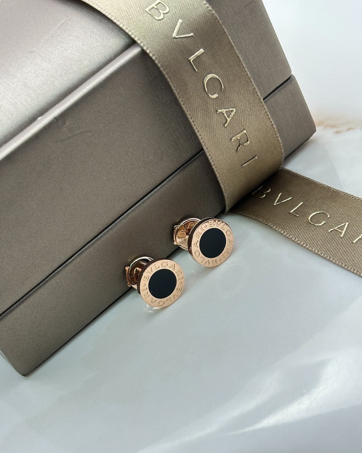
Bvlgari sets its name in Roman capitals with the classical U replaced by V, a small disruption that signals Italian roots without needing a flag.
The serif wordmark appears in gold on boxes, ribbon, and directly on the jewelry, repeated until the letters become texture.
For a designer building a brand, the lesson is restraint: one typeface, one metal finish, applied everywhere the customer looks.
I would reserve this treatment for pieces above a certain price point. On costume jewelry, the same mark would look borrowed.
8. Minimalist Gold Foil Typography
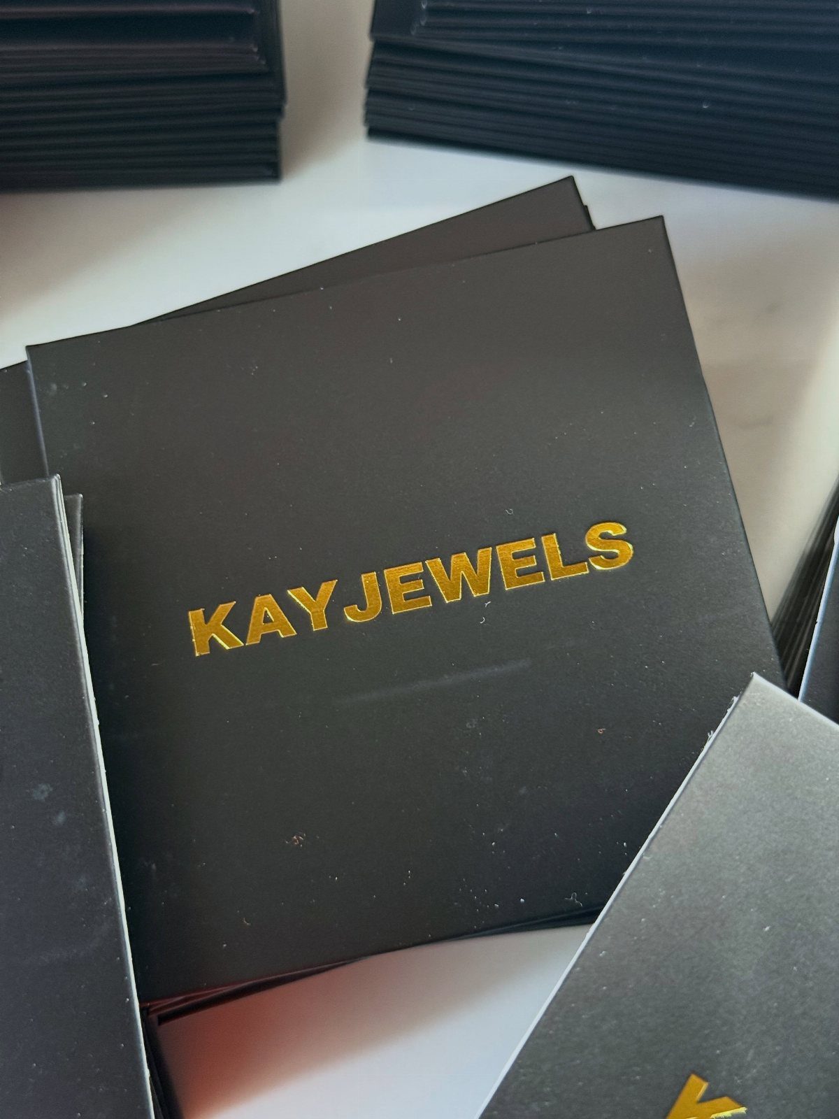
Gold foil stamped into black cardstock catches light the way a display case does, and "KAYJEWELS" in clean capitals proves a symbol is not required to look finished.
The foil sits slightly raised, a physical impression you can feel with a thumb.
This is the cheapest luxury move in packaging.
Foil stamping adds pennies per unit at volume, and the black ground forgives cheaper stock. A modified sans-serif font, perhaps with the R or K altered, gives custom feel without commissioning letters from scratch.
For a new brand testing identity, I would start here. The boxes photograph well for Instagram, and the unboxing carries itself.
9. Lotus and Diamond Monogram
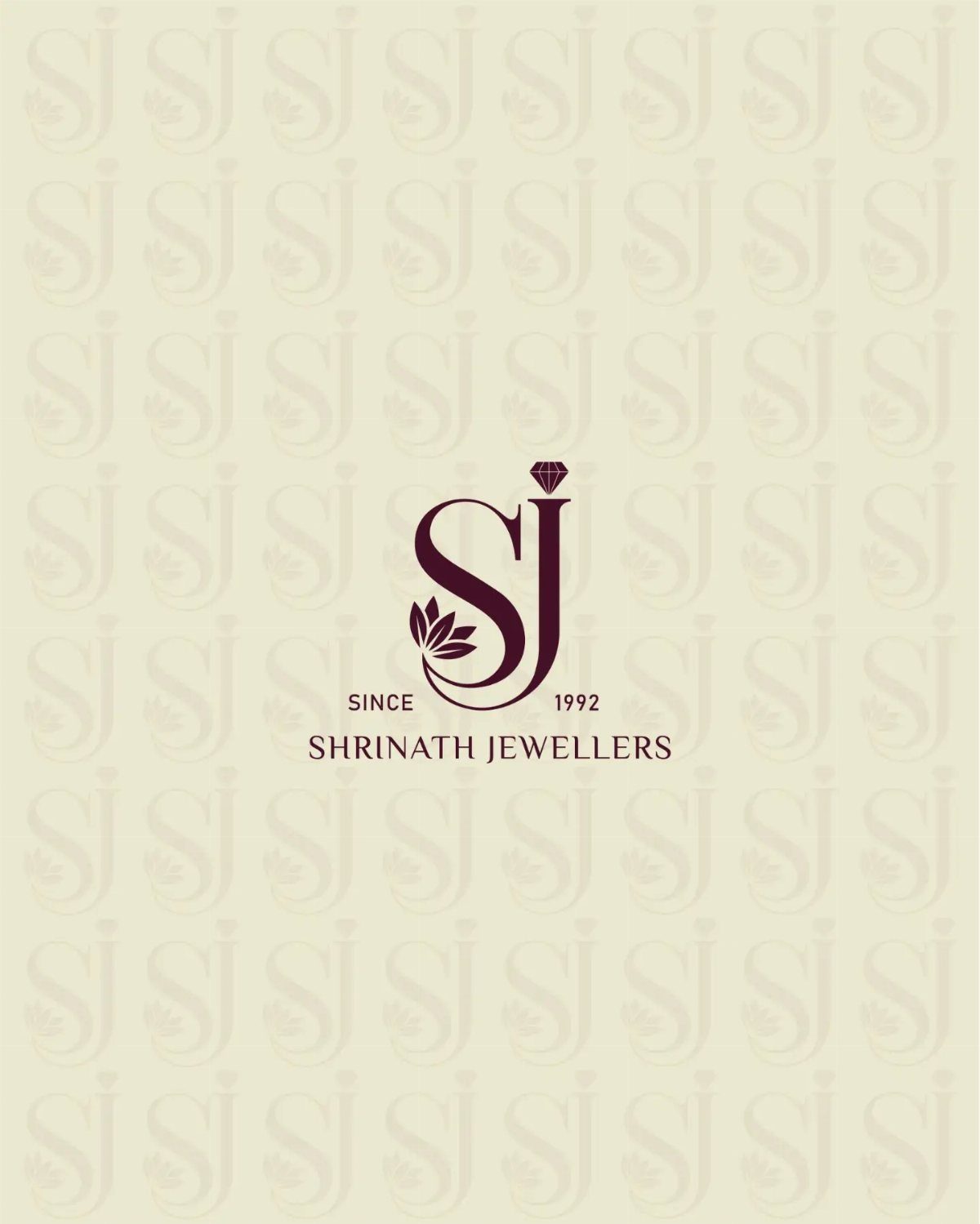
Maroon on beige is a color pairing drawn from Indian wedding invitations, and Shrinath Jewellers uses it to root the brand in tradition.
The lotus frames the diamond and the SJ initials, three symbols stacked where a Western mark might use one.
The monogram approach works when the founder’s name carries local weight.
A specific year feels real; "established" with a round decade would read generic. For a family business passing to a second generation, this structure honors continuity without requiring a crest.
I would tighten the spacing between elements slightly. The lotus leaves enough breathing room that the diamond and letters could move closer, becoming one shape rather than three adjacent ones.
Importance of Logo Design
A jewelry logo carries more weight than in most categories because the purchase is often once-in-a-lifetime and the buyer needs reassurance before they spend.
The mark has to signal heritage or craftsmanship or exclusivity before a customer touches a single piece.
For luxury positioning, I would commission a lettering artist who understands metal finishing and how light plays across a surface.
The investment runs higher than a generic mark, but the logo appears on boxes, ribbon, tissue, and directly on clasps and tags. A single type treatment, repeated until it becomes texture, outperforms a symbol that competes with the jewelry itself.
Brand recognition builds when the same mark appears at every touchpoint.
I would place it on the shopping bag, the warranty card, the polishing cloth, and the interior of the box lid. Each repetition trains the eye.
Minimalism in Logo Design
Minimalism in jewelry logos works because crowded display cases already fight for attention. A quiet mark lets the metal and stones speak.
Researchers found that sparse interiors, single-item displays, and uncrowded racks read as more expensive than dense arrangements.
The same principle applies to the logo itself: one color, one typeface, generous space around the letters. I would rather see a wordmark in a single metal finish than a symbol plus text plus a frame.
Color restraint matters as much as form. A palette drawn from the materials you sell, warm tones for gold and cooler ones for silver and platinum, keeps the brand tied to the product.
I would avoid gemstone brights in the mark itself; let the actual stones provide that saturation.
The simplicity is the luxury.
Color Psychology in Logos
Color psychology in jewelry branding starts with the metals you sell.
Warm palettes signal gold; cool tones read silver, white gold, and platinum. I would match the logo’s temperature to the metal that dominates my cases, so the mark and the merchandise feel continuous.
Clean palettes outperform busy ones in this category.
Jewelry shoppers are already evaluating color in the stones; the logo should not compete. I would limit myself to two colors maximum, one for the mark and one for the ground, with a metallic as one of them.
Tiffany owns robin’s-egg blue so completely that the color alone signals the brand before the logo even appears.
Pantone 1837 did not become recognizable by appearing alongside five other blues; it is the only blue the company uses. For a smaller brand, I would pick one signature tone and refuse every variation that dilutes it.
Brightness belongs to gemstones, not to brand color. A logo that sparkles reads costume; restraint reads precious.
Frequently Asked Questions
What’s an expensive jewelry brand?
Tiffany & Co., Cartier, Harry Winston, and Graff rank among the most expensive jewelry brands.
Graff started in 1960 as a small workshop for custom pieces and built its reputation on large, hand-cut diamonds. These houses signal luxury through restrained logos that repeat a single mark across boxes, ribbon, and tissue until it becomes texture.
Which brand logo is best?
The best jewelry logo depends on what the brand needs to communicate.
Tiffany’s blue box owns a color so completely that shoppers recognize it across a mall corridor. Chopard’s gold cursive on navy reads heritage without a crest.
For mass-market volume, Kay Jewelers’ rounded black wordmark lowers the threshold for first-time buyers. Each succeeds because it matches the positioning, not because it follows a universal rule.
What is a catchy tagline for a jewelry brand?
Strong jewelry taglines emphasize the emotional weight of the purchase rather than describing the metal. Since jewelry buys are often once-in-a-lifetime, the tagline needs to signal reassurance before the customer touches a piece.
I would avoid generic words like luxury or elegance and instead tie the line to a specific brand story, the way a family business might reference a founding year instead of a round decade.